|
|
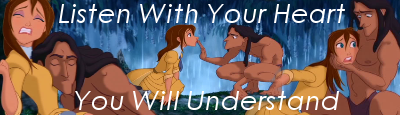
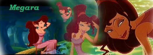
Post by Miss Megara on Jun 14, 2008 22:01:30 GMT -5
|
|
|
|
Post by KairiOfTheDark on Jun 16, 2008 14:05:53 GMT -5
I'm loving the "The right curves" and "I am a boyscout" avatars  Can't wait to see the banners :3 |
|
|
|
Post by Miss Megara on Jun 16, 2008 14:49:06 GMT -5
Thanks. I couldn't pass the boyscout one. Of course you could make so many funny graphics with Icarus. All you have to do is think of something strange. I need to resize a few banners before I stick them up. There are at least 2 that would stretch the page.
|
|
|
|
Post by liongirl on Jun 17, 2008 9:09:38 GMT -5
I like these! They're pretty good!
L.G.
|
|
|
|
Post by Miss Megara on Jun 17, 2008 16:35:26 GMT -5
Thank you. I finished resizing the banners,so yall will see them soon enough.  |
|
|
|
Post by Pride on Jan 24, 2009 21:58:33 GMT -5
You are so great at blending! *is jealous*
|
|
|
|
Post by Miss Megara on Jan 28, 2009 18:53:17 GMT -5
Thanks,but I really don't think I am. Anyway I'll stick up another banner sometime soon. I am just reinstalling some programs after wiping my hard drive.
|
|
|
|
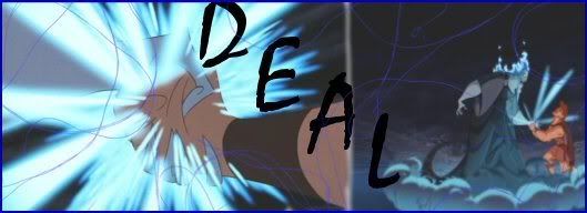
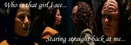
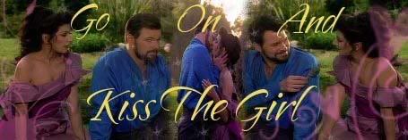
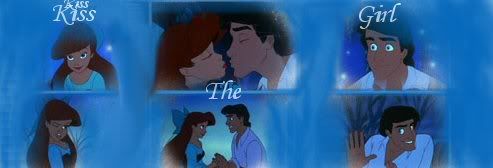
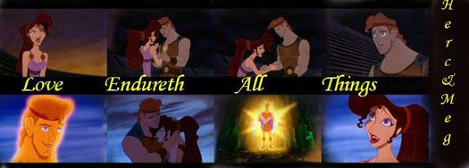
Post by Miss Megara on Jan 29, 2009 19:21:19 GMT -5
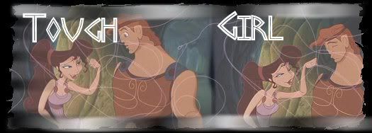
Here are two more banners. I wanted to put text on the Herc/Meg one but I could not think of anything. If anyone has ideas...fire away. 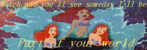 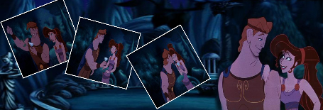 |
|
|
|
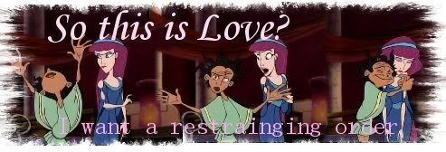
Post by kristin.. on Jan 29, 2009 23:10:36 GMT -5
"DUCK! Actually were birds" that one made my laugh!! ahha  |
|
|
|
Post by Persephone on Jan 30, 2009 18:44:06 GMT -5
The Hercules one is quite good with your placement, really nice organization of the pictures, I would probably add some textures or something, or a screen layer to clarify the pictures a little bit more. Maybe a blurred softlight layer?
(Er, assuming you use Gimp, PSP or PS?) [/blockquote] |
|
|
|
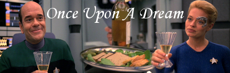
Post by Miss Megara on Feb 6, 2009 16:01:45 GMT -5
I have both PSP and PS. I prefer PSP. Anywho...here is a new banner. I sort of experimented with a few new things just to see how it would come out and what might happen. The white you see is just the color white I put on making the backround transparent. Doing the text was rather interesting...I did many different things to it. How do you think my experimenting turned out? 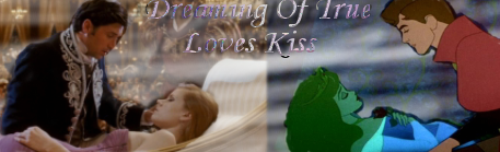 |
|
|
|
Post by Persephone on Feb 6, 2009 23:17:52 GMT -5
I have both PSP and PS. I prefer PSP.
Me too! What version of PSP do you have?
Anyways... Onto the banner:
The two sides seem mismatched, which leads to a lack of unification. I would suggest adjusting the color on one or the other so that they are more unified, or adding some bolder colors as accents to the left and some subtler colors to the right to add some more balance. When cutting a texture/pattern/etc around characters; take your time, zoom in close and do it click by click. It may be slow at first, but after a lot of practice you can get to do it quickly. You can see lines around both that detract from the piece. I like the text, I just think it should be lowered to closer to the centre, perhaps with a some sort of outline or (something I use a lot) do a layer underneath it with the same text in black, drag it just to the left or right of the bottom of the text and set it to soft light - duplicate to taste.  It is a nice idea, it just seems a bit lacking, keep working with it though! It has a lot of potential. It is a nice idea, it just seems a bit lacking, keep working with it though! It has a lot of potential. [/blockquote] |
|
|
|
Post by Miss Megara on Feb 7, 2009 13:55:34 GMT -5
I have version 8.
I didn't do any cutting. I used the eraser tool to clean off the white from each couple. I use the eraser tool a lot. At least you didn't say you couldn't read the text. I'd have to say that was the most difficult...trying to find a color that would match and be readable on both sides.
Thanks for the input.
|
|
|
|
Post by Persephone on Feb 8, 2009 12:08:15 GMT -5
I have version 8.
Me too. (:
I didn't do any cutting. I used the eraser tool to clean off the white from each couple.
I meant taking out other things = cutting them out to me. So no matter what tool you used, you were cutting something out of the picture. You should still be zooming in very close and erasing carefully around them because you can see all of the traces around them and it takes away from the image. [/blockquote] |
|
|
|
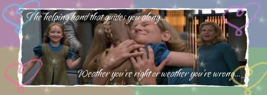
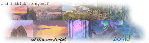
Post by Miss Megara on Mar 25, 2009 14:12:58 GMT -5
A new banner. And a Pocahontas one at that. 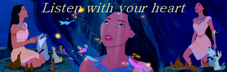 Comments? |
|


 (Made for a friend.)